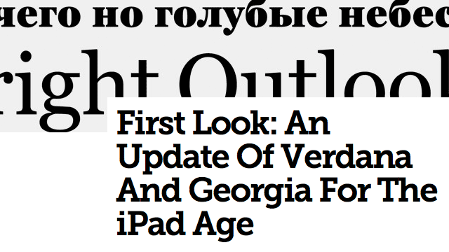
First Look: An Update Of Verdana And Georgia For The iPad Age
An exclusive interview with the legendary Matthew Carter, the man who designed two of the world's most ubiquitous fonts, on updating his classic works for a new era.
An exclusive interview with the legendary Matthew Carter, the man who designed two of the world's most ubiquitous fonts, on updating his classic works for a new era.
First Look: An Update Of Verdana And Georgia For The iPad Age
An exclusive interview with the legendary Matthew Carter, the man who designed two of the world's most ubiquitous fonts, on updating his classic works for a new era.
An article by Suzanne Labarre. Well worth a read for digital typography enthusiasts (and if you work on the web that should be you!).
Verdana Pro and Georgia Pro are being marketed as a way to make the typefaces more appealing to both print and web designers. Each includes additional character sets and 20 weights...
That's a lot of variety!
No mention of licensing terms in the article, but the new versions are available through Web Fonts by fonts.com. Obviously multiple font weights take up a lot of bandwidth so the options are not particularly useful for websites, unlike the previous 1990's versions that are preinstalled on 99% of visiting computers. But if you want a design style that captures the magic of the early web, you can't go wrong here!